Roam ... from the
View menu of the tool:  . Both
the ROI Toolkit, and the Roaming Response dialog will pop up.
First, set up the input images in the dynamic analysis tool, as described in the Introduction. Next, load an image into Jim. The image you load can be any of the input images (or the input image if you have just a single input image).
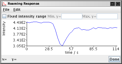
To view the time series of intensities, select Roam ... from the
View menu of the tool:  . Both
the ROI Toolkit, and the Roaming Response dialog will pop up.


Note: the graph may take a long time to appear (several seconds), since all the input images must be opened and the pixel intensity values read before the graph can be computed. Whenever you load new input image(s) into the tool, there will be a delay before the graph can be updated, since these new images must also be opened.
You can drag the ROIs around the image, or create other ROIs and see how the time course of pixel intensities varies across the image. However, only one time course graph can be shown at a time.
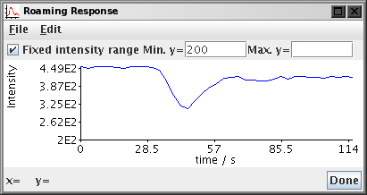
The y (intensity) data ranges of the graph are automatically scaled to match the data. If you want to fix the range of data on the y-axis, select the "Fixed intensity range" check box, and type in a range that you want to be displayed:

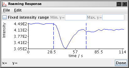
If you have set the time of contrast arrival or the analysis end time in either the perfusion or DCE-MRI tool, then these will be shown as vertical dashed lines superimposed on the response graph.

You can write the graph data to a disk file by selecting
Write from the File menu: 
The graph data is written in a tab-separated table with
two columns: the first is the time value
and the second is the pixel intensity. See also
the File Formats section.
You can write the graph to a PDF document by selecting
Export as PDF from the File menu: 